
Digital Transformation: UX/UI for CTC Foodservice
UX/UI DESIGN
Replacing static websites with high-conversion digital sales funnels
The Goal: Bridging the Digital Gap
I led the pivot from traditional physical catalogs to a one-pager interactive hub to increase sales calls.
The Mission: Replace lost revenue opportunities with a digital sales catalog embedded in microsites.
The Problem: B2B clients were struggling with "dense" catalog data and higher costs of paper catalogs.
The Solution: An interactive, shoppable landing page that streamlined complex project workflows.
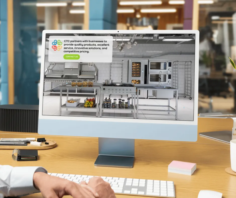
I designed this landing page to guide users directly into the digital catalog experience.
A Research-Led Design Process
I followed an end-to-end UX lifecycle to ensure the final product solved user problems and met client goals.
User Research: Conducted interviews to understand how B2B clients interact with massive product lists.
Information Architecture: Developed user flows and wireframes to simplify navigation.
Prototyping: Built high-fidelity prototypes in Figma and ran usability tests to fix friction points before launch.
Strategic Microcopy: UX writing and worked with proofreaders to ensure buttons and technical labels were clear and full of personality.
Measurable Business Outcomes
This data-driven approach delivered clear, professional results:
Print to Digital Pivot: By providing access to the client's inventory and product knowledge.
User Experience: Website visitors are able to shop the entire inventory and learn more about products without leaving the homepage by embedding the digital catalog.
B2B Leads: We saw a measurable increase in qualified leads and brand visibility at national trade shows.
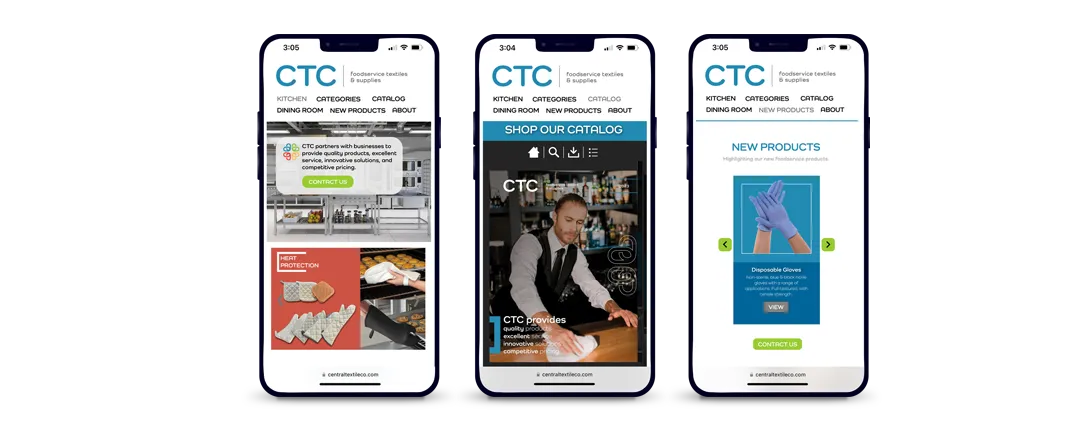
UI/UX Design for multiple screens for mobile responsiveness using Fastr Frontend
The CFI Digital Hub: UX/UI Lead
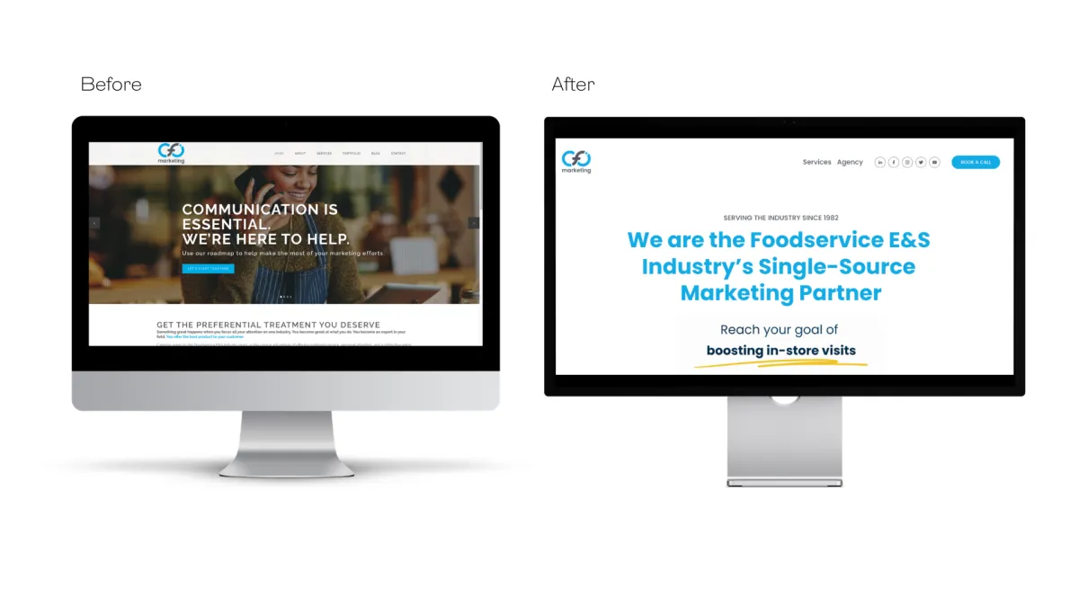
I led the UX/UI redesign of the agency's primary website to shift from a "traditional print" image to a "digital-first" marketing partner.
Platform: Built and managed entirely on Squarespace.
The System: Designed a responsive site that houses digital catalogs, lead magnets, and educational content.
The Result: Created a centralized location for diverse foodservice clients to discover and book digital marketing services.
Streamlining B2B Operations: Buccaneer Glass Microsite
Centralizing a fragmented ordering process into a high-utility digital hub.
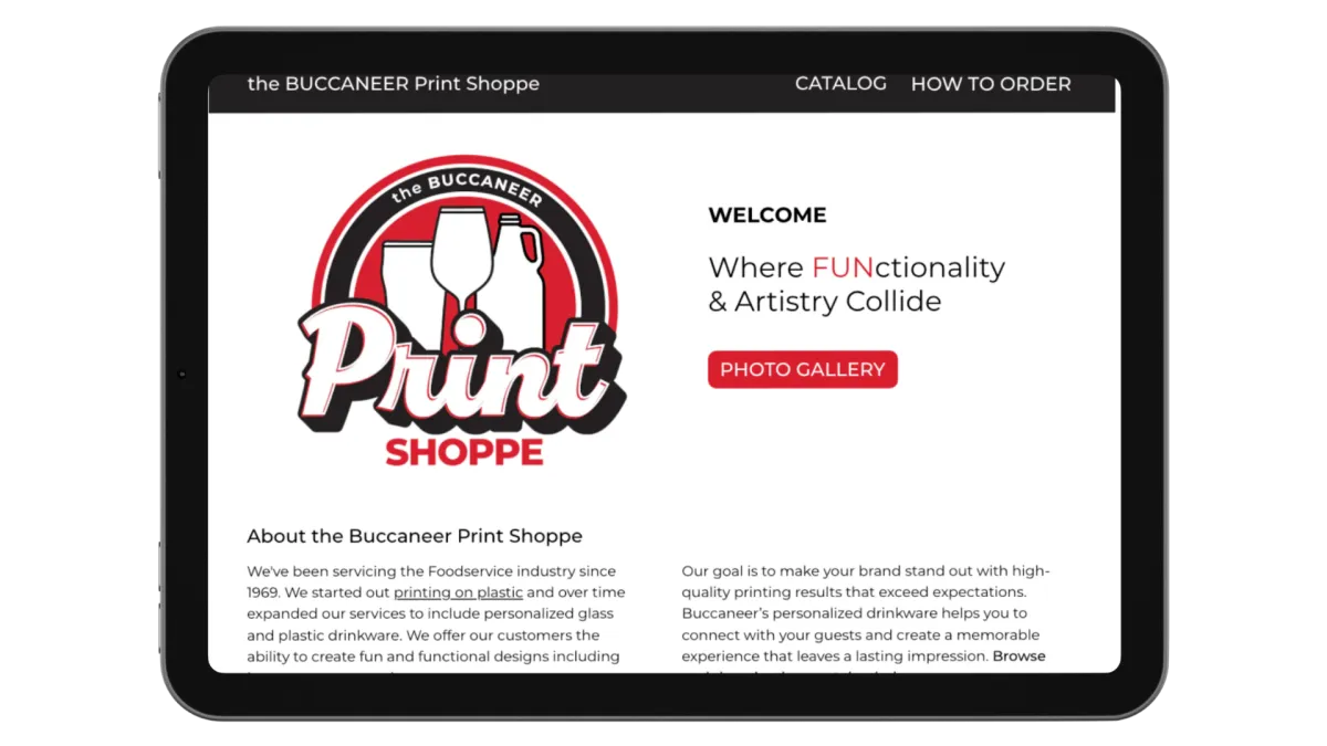
I designed this microsite to act as a digital concierge for restaurant and bar managers.
The Objective: Solving the Discovery Gap
Buccaneer Glass provides high-quality branding for global glassware companies, but they lacked a central "Source of Truth" for their catalog and ordering instructions.
The Problem: Dealers and managers had no way to view products or understand the order flow online, leading to slow turnaround times.
The Goal: Create a streamlined landing page that educates the user and accelerates the path to purchase.
The Role: I led the UX strategy and coordinated with a Graphic Designer to embed a cohesive catalog into a functional web environment.
Making the Complex Simple
I focused on Information Architecture to ensure that technical printing specifications didn't overwhelm the user.
User Journey: I mapped out a 3-step path: Discover (The Catalog) to Learn (The Quality Standards), to Act (The Order Button).
Visual Hierarchy: Used bold headings and clear call-to-actions (CTAs) to reduce the "cognitive load" for busy managers.
Embedded Utility: I integrated the catalog layout directly into the UX flow, allowing users to browse without ever leaving the brand experience.
The Results: Faster Orders, Clearer Brand
This microsite transformed Buccaneer from a "hidden manufacturer" into an accessible digital partner.
Efficiency: Reduced the time spent on manual order explanations by providing a 24/7 self-service resource.
Brand Trust: By showcasing "Reliable Print" and "High-Quality Services" visually, we built immediate credibility with new dealers.
Accessibility: Designed a clean, professional UI that looks great on both mobile (for on-the-floor managers) and desktop (for office procurement).
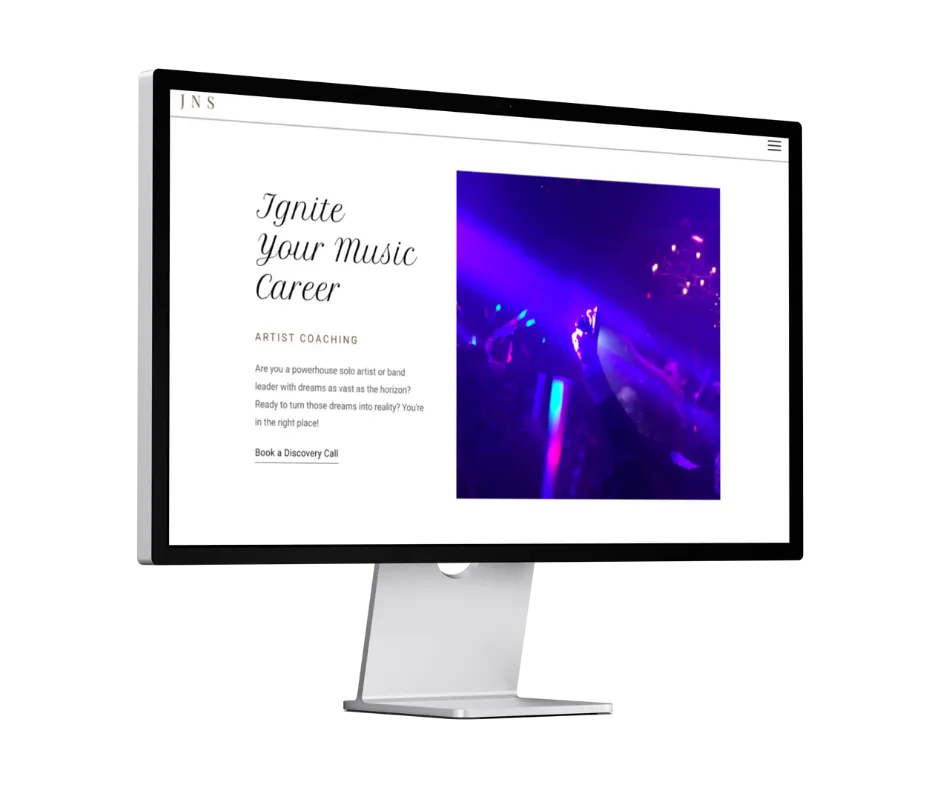
Certification Project: Artist Development Platform
For my Google UX Design Specialization, I designed an end-to-end platform for artists and bands to manage their brand development.
User Research: Conducted interviews to identify that solo artists struggle with the "business" side of music.
User Personas: Created detailed personas (like "Emma J.") to map out the specific pain points of independent creators.
The Pivot: Based on usability testing, I pivoted from a "form-heavy" discovery process to a "direct-booking" calendar system to reduce user drop-off.
View the Case Study on Behance!


© Copyright 2026. Jessica Northey Studios. All Rights Reserved.